

Reservations
Platform
April - July (2023)


April - July (2023)


Cherry Hill sought to enhance the customer experience for reserving, booking, and accessing reliable information about available experiences.

My greatest focus was on making sure the flow from site to checkout was as intuitive and seamless as possible, addressing huge road blocks for customers and follow through, and making checkout convenient and safe.

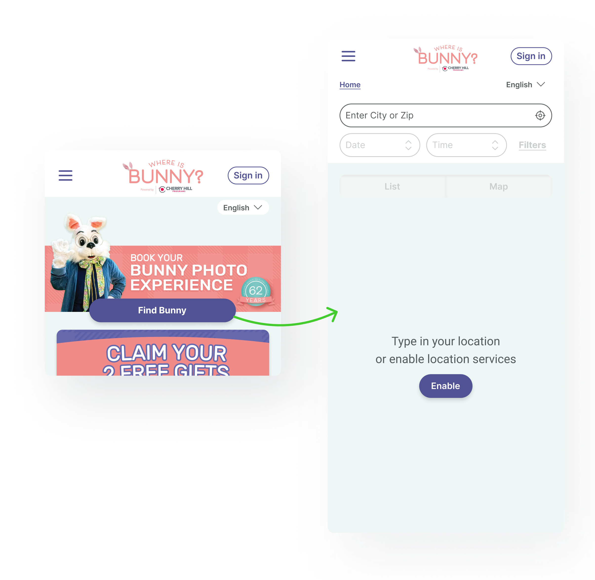
We kept the entry point simple and isolated user interaction to prevent overwhelming the user.
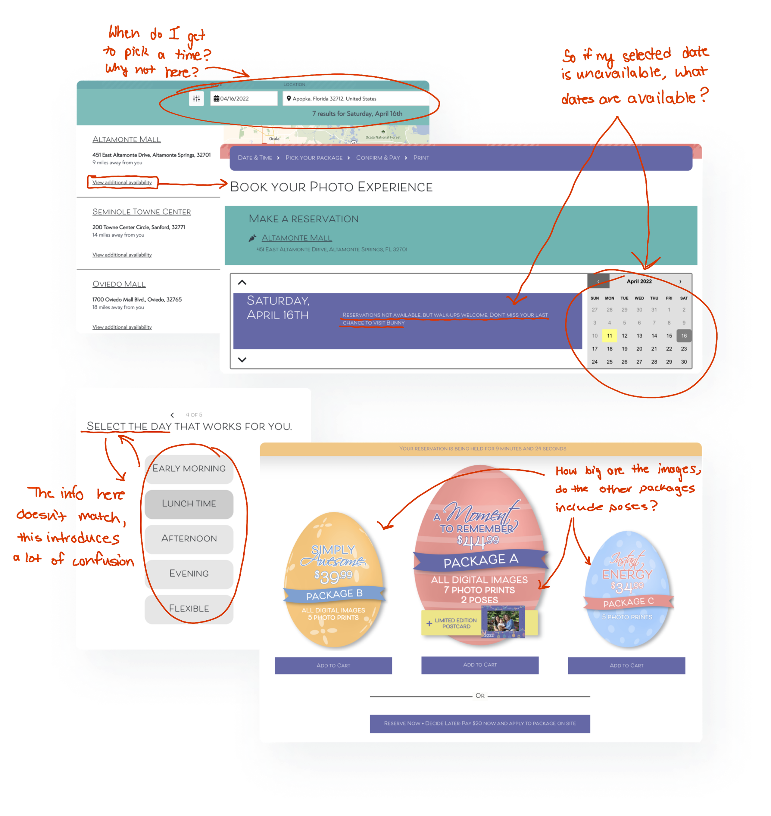
Next, I made the interactions on the locations page, work for the user. Adding elements that clearly display status and availability.

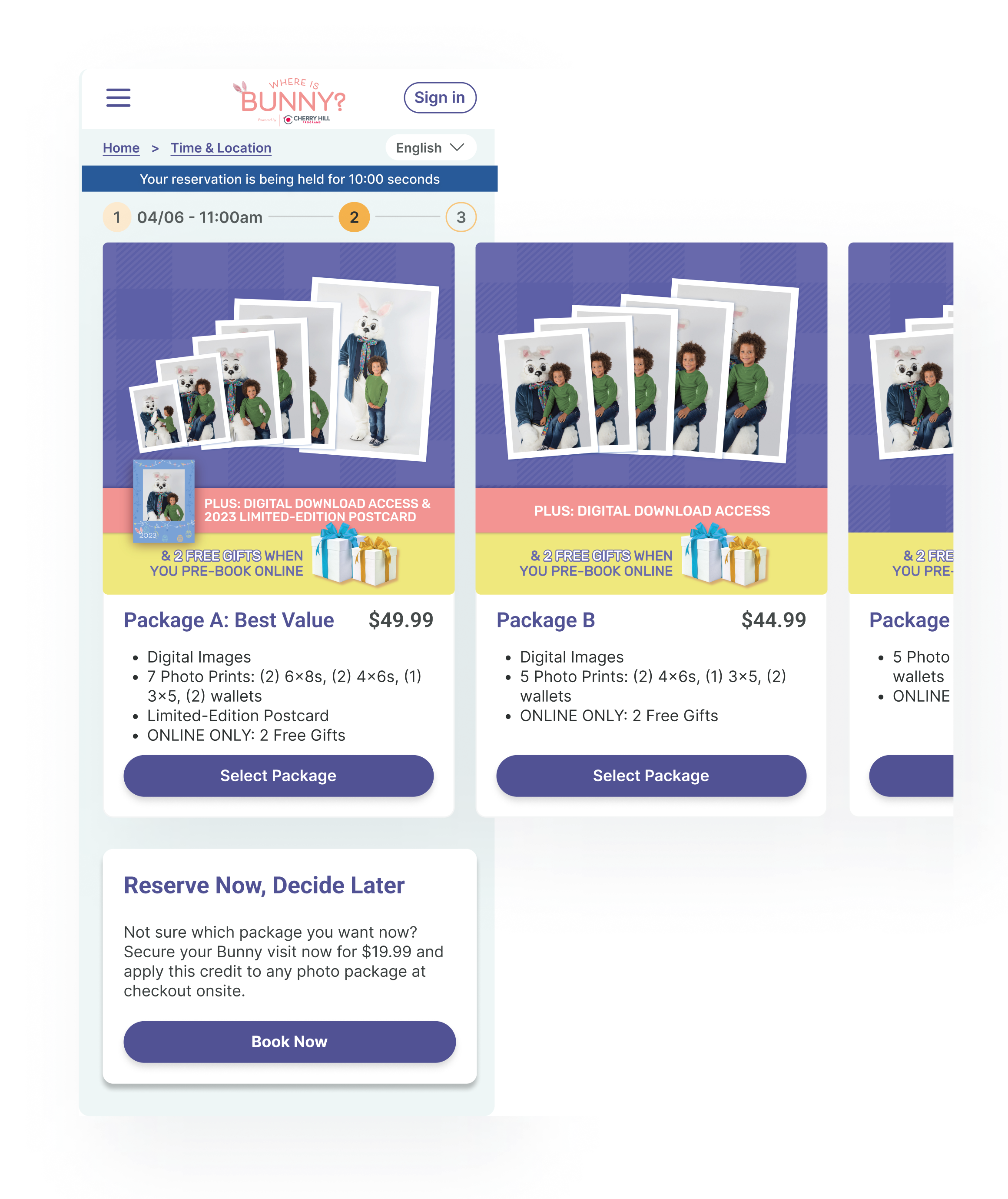
I carried these patterns to the package selection page, designing the layout to answer the questions frequently brought up through user feedback.
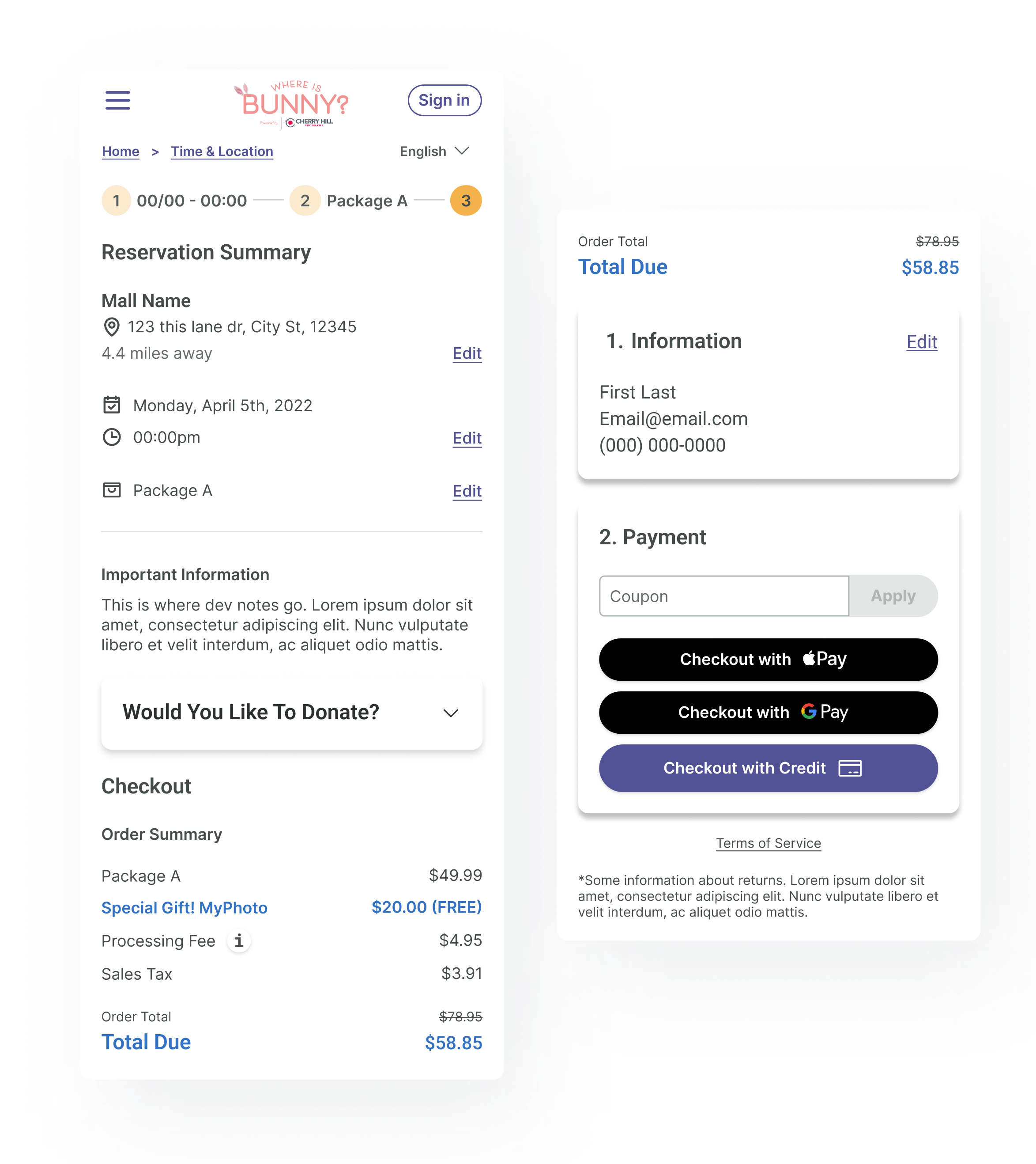
Implemented features that let users easily review and update crucial information during checkout.
While introducing multiple payment options to improve convenience and increase conversions.
Take a behind-the-scenes look at the research and preparation that informed my decisions, along with the reasoning behind each choice.
